
 Italiano
 Português
 Amazon
 Ebay
Ebay
How Color Psychology Influences Roller Bottle Packaging?
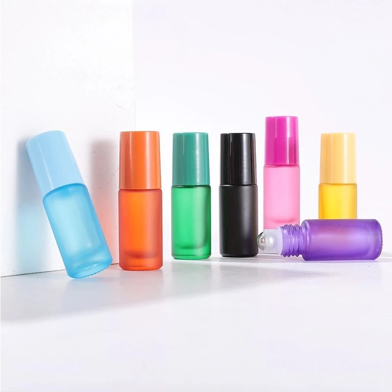
🩷 Introduction
In the skincare, essential oil, and personal care product categories, consumers often form their first impression of a product within seconds. For small-capacity packaging, color is even more crucial in determining whether a product is “seen” or “ignored.”
Color psychology not only influences consumer emotions but also significantly improves product recognition and ultimately drives purchases. Appropriately utilizing color psychology is one of the most cost-effective and fastest strategies for increasing the conversion rate of rollerball bottle products.
🧡 What Is Color Psychology
1. How Color Affects Emotions
Color psychology studies how different hues evoke emotional associations and subconscious responses through visual stimulation. When consumers see packaging colors, they can quickly match “color with emotion.” This subconscious color perception often precedes the processing of text or brand recognition.
2. The Role of Color in Consumer Behavior
In product presentation, color plays multiple roles:
-
- Vibrant or harmonious color combinations can quickly attract attention, making products stand out on shelves or e-commerce thumbnails;
- Appropriate color choices help build trust—cool colors make consumers believe that the product is more suitable for sensitive skin or sleep aid purposes;
- Color significantly enhances product memorability; consumers will repurchase or recommend products based on their unique color rather than the product name.
3. The Relationship Between Packaging Design and Color Marketing
-
- Packaging design is essentially a silent sales language, and color is its most efficient communication tool. Color often conveys information faster than text.
- For small-capacity packaging, the space for textual information is extremely limited, making color the most direct bridge for dialogue between the brand and consumers.
💛 How Different Colors Communicate Brand Messages
1. Blue Roll-on Bottle: Trust and Freshness
In roll-on bottle packaging, blue is commonly used for skincare and soothing products, conveying purity, professionalism, and safety. Darker bottle designs naturally evoke images of the ocean and calming, restorative essential oils.
2. Green Roll-on Bottle: Natural and Eco-friendly
Green is suitable for organic skincare and essential oil products, emphasizing a natural and healthy brand image. Green is particularly suitable for roll-on products that emphasize pure formulas, environmental concepts, or plant-based extracts, effectively reducing consumer concerns about chemical ingredients and enhancing the perception of “natural and additive-free.”
3. Purple Rollerball Bottle: High-End and Mysterious
Purple is commonly found in fragrances and luxury beauty products, conveying elegance and quality. Paired with a frosted finish and a metallic cap, a purple rollerball bottle easily creates a mysterious and sophisticated atmosphere.
4. Orange Rollerball Bottle: Vibrant and Youthful
Orange combines the passion of red and the vibrancy of yellow, quickly conveying energy and warmth. Orange is suitable for vibrant fragrances and personal care products; using orange significantly enhances product appeal and attracts younger consumers.
5. The Visual Difference Between Transparent and Frosted Finishes
Besides the color itself, the texture of the bottle also affects the transmission of brand information:
-
- Transparent packaging highlights the product itself—allowing consumers to directly see the color, purity, and remaining quantity of the product inside, enhancing authenticity and trust.
- Frosted packaging, on the other hand, reinforces a high-end feel—the frosted surface softens light, conceals slight sediment, and creates a hazy, elegant visual experience.
In actual design, transparency and frosted finishes can be used in combination to achieve a balance between “realistic display” and “enhanced texture,” meeting the needs of different brand positioning.
💚 How Colors Affect Purchasing Decisions
1. The First Visual Competition on the Shelf
In physical stores or e-commerce search results pages, color is the primary factor determining whether consumers stop to pay attention. For small-volume packaging, color is almost the only “magnifying glass”—it helps roll-on bottles stand out on crowded shelves or mobile phone screens, winning attention.
2. Color and Product Efficacy Associations
Consumers instinctively associate specific colors with specific effects:
-
- Blue/Purple➡️Soothing, sleep-aiding, calming
- Green➡️Repairing, anti-acne, natural
- Orange/Yellow➡️Energizing, vibrant, warm
- Pink/Red➡️Gemstone-like, nourishing, romantic
3. Enhance Brand Memorability
Unique colors help consumers quickly recognize a brand and form long-term brand memory. Classic examples include Tiffany blue and Hermès orange—the colors themselves have become synonymous with the brand.
For small and medium-sized brands, choosing a distinctive packaging color and consistently using it across multiple products can significantly improve brand recognition efficiency during repeat purchases.
4. The Visual Communication Advantages of the Social Media Era
On visually driven platforms like Instagram, TikTok, and Xiaohongshu, “high visual appeal” is itself a powerful force for dissemination. Beautifully designed packaging is more likely to be photographed and shared by users, added to “unboxing videos,” or featured in “high-value product” compilations.
Brands can even launch “limited-edition color roll-on bottles” for different social media platforms, using color to create buzz and encourage spontaneous sharing by users.
🩵 Color Selection Strategies for Roller Bottle Packaging
1. Choose colors based on the target consumer group
Different consumer groups have different preferences for packaging colors. Younger consumers typically prefer bright and vibrant colors; while brands targeting the high-end market tend to choose low-saturation or dark-colored packaging to convey a professional, sophisticated, and high-quality image. Diverse color schemes can meet the aesthetic needs of different consumer groups.
2. Choose Colors Based on Product Category
Packaging colors should be consistent with product attributes. Perfume rollerball bottles often use sophisticated colors; essential oil rollerball bottles often use natural tones such as green and brown; skincare rollerball bottles usually lean towards fresh and soft light colors. Appropriate color matching helps consumers quickly understand the product positioning and enhances their purchase intention.
3. Unified Planning Based on Brand Positioning
When choosing rollerball bottle packaging, brands should maintain a unified overall visual style. A unified packaging design helps establish brand recognition and improve market competitiveness.
4. Advantages of Multi-Color Packaging Series
For brands with multiple product lines, multi-color packaging is an efficient management method. Using different colored packaging makes it easy to distinguish different fragrances, effects, or formulas. At the same time, colorful packaging series can create a stronger shelf display effect and visual impact, helping brands build a complete product matrix and enhance consumer brand recall.
💜 Conclusion
Color psychology is profoundly influencing consumer purchasing behavior. The color of roll-on bottle packaging is not only about visual appeal but also directly impacts brand perception and market competitiveness.
In the future, beauty, fragrance, and essential oil brands will place greater emphasis on the application of color strategies in packaging design. Color will no longer be merely decoration but a core strategic asset of the brand.
Last Updated: 2026/06/05

 English
  Italian