
 Italiano
 Português
 Amazon
 Ebay
Ebay
How Pastel Packaging Is Taking Over the Skincare Industry?
💛 Introduction
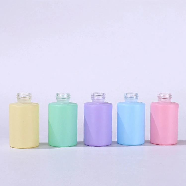
Say goodbye to the cool, futuristic silver-gray and the overly luxurious black and gold color schemes of the past; now, shelves are filled with soft, low-saturation colors.
So, what’s the magic behind this macaron-colored packaging inspired by French desserts, allowing it to stand out in the fiercely competitive beauty packaging market? And as this trend intensifies, how can brands avoid becoming homogenized?
💚 What are Macaron Colors?
To understand its popularity, we must first define it. The so-called “macaron color scheme” is not simply high-brightness bright colors, but rather a group of soft hues with low saturation and high brightness. This color scheme retains the purity of color while eliminating visual impact and aggression by reducing saturation.
Macaron colors inherently possess a hazy, filter-like quality, giving a dreamy, light, and harmless visual experience. Unlike the cool-toned packaging that emphasizes “efficacy” and “technology” in the past, the macaron color scheme seems to convey a “lifestyle” and “emotional value.”
💜 Why are Pastel Colors so Appealing to Youngers
The success of macaron colors stems from the brand’s precise application of consumer psychology and its keen grasp of the evolving aesthetic preferences of the younger generation.
1. Psychological Resonance: Providing Scarce “Emotional Value”
In today’s fast-paced, high-pressure lifestyle, emotional value has become a key factor in consumer purchasing decisions.
-
- Natural Healing Power: Color psychology research shows that soft pinks, blues, and greens can effectively soothe nerves and reduce anxiety. When consumers see macaron-colored packaging, they subconsciously experience a sense of relaxation and pleasure.
2. Visual Breakthrough: An Eye-Catching Weapon on the Shelf
In an era where “appearance is everything,” visual marketing is a product’s primary competitive advantage.
-
- Breaking Homogenization: Macaron colors, with their unique and highly recognizable nature, can instantly capture consumers’ attention amidst a dazzling array of products.
- Creating a sense of sophistication: Properly used low-saturation colors don’t appear cheap; instead, through minimalist design and delicate textures, they create an “Instagram-worthy” sense of sophistication and a refined lifestyle.
3. A Natural Darling of Social Media: The “Influencer” Quality of UGC Dissemination
Without the boost from social media, macaron colors might not have become so popular.
-
- “High visual appeal” equals traffic: On platforms like Xiaohongshu and Douyin, technological advancements have made “high visual appeal” the primary driving force for product sales. Macaron-colored packaging, with its soft colors and versatility, is practically a photogenic wonder. Users, eager to share this beautiful visual experience, spontaneously become brand advocates.
- Conveying a gentle philosophy: Many skincare brands using macaron colors emphasize natural, gentle, and additive-free products. The packaging colors are highly consistent with the product’s “natural” and “skin-friendly” attributes, strengthening brand equity.
🩵 Trends and Reflections
However, any trend, once it reaches its peak, is often accompanied by diminishing marginal returns. When everyone is wearing the same monotonous Morandi and macaron colors, a new kind of visual fatigue is quietly brewing.
1. Returning to Brand Narrative
Brands shouldn’t blindly follow the trend just because macaron colors are popular. Color must serve the brand’s core philosophy.
-
- Differentiation Strategy: Smart brands begin to segment and fine-tune macaron colors. (For example, a brand focusing on “plant extracts” might choose a deeper, more natural “forest green” or “dried rose pink.”)
- Storytelling: Packaging is not just a container, but a medium. Brands can tell their story through illustrations and typography on packaging, making color the backdrop, not the protagonist.
2. A “Reduced-Dimensional Attack” in Materials and Craftsmanship
When colors converge, touch becomes the new battleground.
-
- Texture Upgrade: The same color, applied to frosted glass, smooth ABS plastic, or skin-friendly silicone, evokes drastically different feelings. More and more brands are using special materials (such as ceramic-like textures, recycled pulp, and tactile oils) to elevate the quality of their packaging, differentiating themselves from cheap imitators.
- Structural Innovation: Besides color, innovative bottle structure is also key to differentiation. Unique opening experiences and pump designs allow consumers to appreciate the brand’s thoughtfulness during use.
3. A New Track for Sustainable Development
With growing environmental awareness, mere visual beauty is no longer enough to appeal to young consumers with a strong sense of social responsibility.
-
- Eco-Friendly Aesthetics: The future of macaron packaging must not only be “good-looking” but also “green.” Using biodegradable materials, reducing plastic use, and designing refillable inner liner will be crucial for brands to stand out in a sea of pink.
🩷 Conclusion
The macaron-colored packaging that swept the beauty industry was undoubtedly a successful visual marketing campaign. It accurately captured the spirit of the times, soothing hearts with the gentle power of color.
However, brands must be keenly aware that once the initial novelty wears off, what truly retains consumers is the product’s core efficacy and the long-term value conveyed by the brand. In future competition, only brands that can perfectly combine an “eye-catching exterior” (macaron packaging) with an “interesting soul” (product strength and brand philosophy) will ultimately emerge victorious in this sweet storm.
Last Updated: 2026/07/16

 English
  Italian