
 Italiano
 Português
 Amazon
 Ebay
Ebay
Beyond Formulas: Packaging That Increases Skincare Value
🍁 Introduction
Over the past few years, the beauty and skincare industry has witnessed a frenzied ingredient race. Major brands have been scrambling to pile ingredients onto their ingredient lists to demonstrate product efficacy and commitment. However, when all high-end brands can use top-quality raw materials, and efficacy claims have become almost homogenized, what can truly impress increasingly discerning consumers?
If the formulator is the “soul” of a skincare product, then packaging is its “first impression.” When consumers see a product, their decision to buy it often hinges on the visual and tactile impulses they experience within those few seconds.
🍁 Five Design Elements of a High-Value Packaging
In consumer behavior, there’s a famous “7-second rule”: consumers decide whether to buy a product within 7 seconds. In this brief time, color and material play a decisive role.
1. Frosted Glass: A Silent Expression of Sophistication
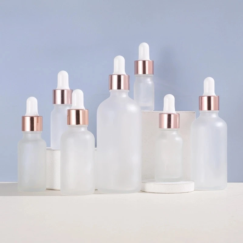
Compared to fully transparent glass, frosted glass bottles present a semi-transparent, hazy texture. This treatment is not merely visual decoration—it conveys at least two messages to consumers:
-
- First, the frosted surface effectively conceals tiny air bubbles or color changes within the contents, ensuring the product maintains a “perfect appearance” in any situation. For certain active ingredients prone to oxidation and discoloration, frosted glass also provides a degree of light filtering protection, slowing down ingredient degradation.
- Second, the frosted texture itself carries a psychological suggestion of sophistication. When a consumer’s fingers glide across the bottle, the delicate yet not cold touch already establishes an initial tactile connection to the product’s positioning.
2. Rose Gold Plating
-
- Compared to traditional bright silver or gaudy gold, rose gold combines the sophistication of metal with the gentle elegance of pink, perfectly aligning with the aesthetic preferences of the target skincare consumer group.
- Using rose gold elements on the neck and edge of the dropper cap creates a slender yet striking visual waistline. This “embellishment” approach is more restrained and sophisticated than using metallic colors extensively—it doesn’t overshadow the understated elegance of the frosted glass, while visually adding depth and a “refined anchor point” to the bottle.
3. Rounded Shoulder Design: Breaking Awkwardness from Sharp Angles
-
- Compared to traditional bright silver or gaudy gold, rose gold combines the sophistication of metal with the gentle elegance of pink, perfectly aligning with the aesthetic preferences of the target skincare consumer group.
- Using rose gold elements on the neck and edge of the dropper cap creates a slender yet striking visual waistline. This “embellishment” approach is more restrained and sophisticated than using metallic colors extensively—it doesn’t overshadow the understated elegance of the frosted glass, while visually adding depth and a “refined anchor point” to the bottle.
4. Dropper Design: A Functionalistic Design for Precise Dispensing
-
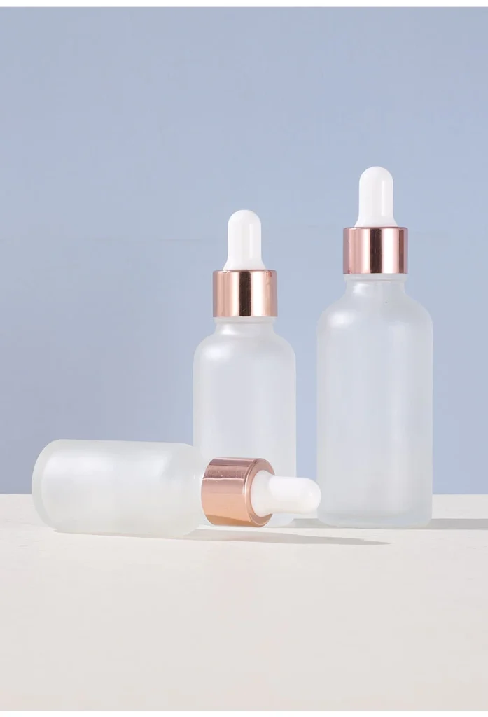
- As a standard feature of serum products, the design quality of the dropper directly impacts the user’s perception of the product’s professionalism. The glass dropper paired with a white rubber tip ensures precision in dispensing (allowing control over the amount of each drop) while also creating a clean and sophisticated look with the frosted bottle and rose gold trim.
- The transparent glass material of the dropper allows consumers to clearly see the amount and texture of the liquid being dispensed. This “visual” design enhances the sense of control and ritual during use. For high-priced serum products, each precise dispensing positively reinforces the consumer’s purchase decision.
5. Overall Harmony of Color and Light
Looking at all the elements together, the color logic of this packaging is very clear: frosted glass provides a neutral and soft base; rose gold injects a warm and refined highlight; and the white rubber tip maintains a clean and pure feel. The three tones are restrained in saturation, contrasting in texture, ultimately presenting an overall image that can withstand close scrutiny and photographic scrutiny.
🍁 From Shelf to Mobile Phone Screen: the Contextualization of Dropper Bottle Packaging
If visual appeal is the “hook” that attracts consumers, then touch is the “anchor” that keeps them engaged.
-
- The interplay of glass and skin: The tactile experience begins the moment a consumer picks up this rose gold frosted dropper bottle. The subtle graininess of the frosted glass surface conveys a solid and grounded feel.
- The ritualistic aspect of the dropper: The inherent qualities of a dropper bottle are “precise dosage” and “sterile dispensing.”
- The sense of stability in the hand: The rounded shoulder design allows even a woman’s hand to perfectly fit the bottle. When the hand holds the bottle, the contrast between the rose gold and frosted glass, and the warmth or coolness felt by the hand, subtly convey—this is a substantial and valuable item.
🍁 Beyond Efficacy, Trust in Packaging
Modern skincare packaging needs to adapt to two distinct display environments: the vertical shelves of physical retail stores and the two-dimensional screens of digital platforms. Successful packaging must excel in both scenarios.
In physical settings, the frosted glass texture produces a soft, diffused light reflection under lighting, avoiding glare or a flimsy appearance. The rose gold trim captures subtle light variations in the complex lighting of a shopping mall, attracting attention from passersby.
In digital settings, this packaging performs even better. The uniform texture of the frosted surface maintains clear visual detail even in highly compressed images on mobile screens; the warm tones of rose gold are less prone to distortion under various filters and beauty algorithms; and the rounded shoulder design provides excellent silhouette recognition in both still images and videos. Whether for flat lay photography, handheld displays, or unboxing videos, it consistently delivers high-quality visual content.
🍁 How to Choose the Right Dropper Bottle Packaging?
If you’re looking for skincare brand packaging, how do you make a choice you won’t regret, given the vast array of dropper bottle options on the market? Here are three proven decision-making principles:
-
- First, the material must align with the product positioning. If your brand focuses on clean beauty, frosted glass, recyclable materials, and minimalist design are more natural choices; if your brand emphasizes a technological or cosmeceutical background, you might need stronger lines and a cooler metallic feel.
- Second, the color scheme must serve brand identity. While rose gold is trendy, it’s not suitable for all brands. The key is whether the chosen color elements create harmony or intentional tension with your brand’s main color scheme, rather than blindly following trends.
- Third, the feel must withstand daily use. Packaging that only looks good on the shelf but feels slippery or uncomfortable to hold will gradually accumulate negative experiences for consumers over time. Before finalizing the design, be sure to hold a sample yourself and simulate the actual use process.
🍁 Conclusion
The skincare industry is undergoing a silent value reconstruction. As formula innovation enters a more complex phase and ingredient upgrades approach saturation, competition among brands is shifting towards “who can provide consumers with a more complete and enjoyable experience.”
For brands, investing in good packaging may be the shortest shortcut to enhancing product value, beyond just formula.
Last Updated: 2026/08/07

 English
  Italian