
 Italiano
 Português
 Amazon
 Ebay
Ebay
Wood-Grain Glass Packaging Combines Sustainability and Style
🪵 Introduction
In various niche markets, competition in the food industry has long since extended from ingredients and efficacy to packaging visuals. When consumers make a purchase, the first impression of the packaging directly determines brand memorability.
This article, using a wood grain water transfer printed cap dropper bottle as an example, breaks down practical methods for empowering brand visual identity with 10ml glass dropper bottles, providing brands with readily implementable packaging upgrade ideas.
🪵 Basic Bottle Material and Color
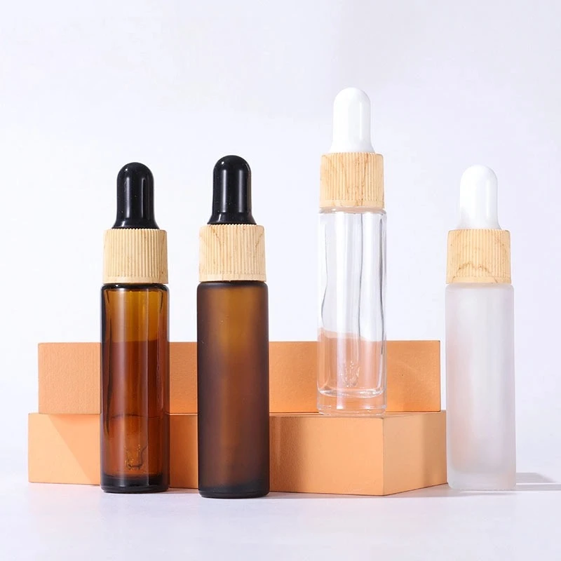
The foundation of visual identity begins with the material and color of the container itself. The small size of the 10ml glass bottle amplifies the visual impact of its color. Different bottle shapes directly define the brand’s basic style and are also the most intuitive first impression for consumers.
Brown bottle: a label of natural and organic, and professional skincare
Brown glass dropper bottles are a classic choice for essential oils, medicinal serums, and functional essences. The brown glass provides light protection, effectively blocking UV rays and protecting photosensitive active ingredients, functionally meeting skincare needs while visually conveying a natural and professional brand image.
Furthermore, brown is a low-saturation, calming color that looks sophisticated and is versatile for printing; gold foil stamping, silver foil stamping, and silkscreen logos all display perfectly. Long-term use of a consistent bottle color will gradually create a fixed visual identity.
Transparent glass bottle: Pure and luxurious, transparent ingredients
This 10m dropper glass bottle, made of clear, high-white material, emphasizes purity, transparency, and minimalism. The transparent bottle allows for a direct display of the contents’ texture, color, and flowability, embodying the brand’s commitment to visualization and transparency and enhancing consumer trust. Visually, the transparent bottle exudes a simple yet sophisticated feel, aligning with the aesthetic trends of minimalist skincare and pure makeup, creating a clean and crisp brand visual identity.
Frosted glass bottles: Enhanced texture, creating differentiation
Frosted glass treated with acid washing and frosting has a delicate touch, a high-end matte finish, and a light refraction effect that differs from ordinary bottles.
🪵 Core Differentiated Components
1. Natural Wood Grain Texture
Water transfer printing technology can realistically reproduce the vertical grain texture of natural wood on a plastic base, giving the lid a clean and natural solid wood look, but at a much lower cost than a solid wood screw cap, making it extremely cost-effective. The wood grain itself possesses a natural, rustic, and original visual language, perfectly matching the brand positioning of plant-based skincare and natural organic products, visually embodying the brand’s philosophy through packaging.
2. Color-Differentiation of the Cap and Rubber Tip
While maintaining the wood grain threaded base, the silicone rubber tip on the top can be color-differentiated, achieving visual categorization of products within the same bottle type and further refining the brand’s visual identity.
3. Exclusive Craftsmanship
Pure solid wood rings are prone to cracking, moisture damage, and warping, resulting in high costs and inconsistent quality control; ordinary printed wood grain is prone to paint peeling and wear, giving it a cheap feel. Water transfer printing wood grain caps involve heat-transferring a wood grain film entirely onto the cap surface, resulting in strong adhesion, wear and scratch resistance, and a realistic, three-dimensional texture.
🪵 Bottle Printing and Customized Design
The bottle’s exterior serves as a direct carrier for displaying the brand logo, slogan, and visual elements. Although the 10ml glass bottle is small in size, proper printing customization can turn each dispensing bottle into a mobile brand advertisement, continuously reinforcing visual recognition.
Unified logo printing enhances brand exposure
10ml dropper bottles are mostly used for trial packs, samples, and sets, and will be in the hands of countless end users as the product’s fragrance lingers, making them versatile in usage scenarios. The logo, brand name in gold foil, and minimalist icons are silkscreened on the amber, tinted, or frosted bottle body, ensuring that every time a consumer picks up and uses the product, it’s a visual encounter with the brand.
Minimalist visual copywriting conveys brand positioning and enriches brand recognition
In addition to the logo, a brief brand message can be printed on the bottle using minimalist text. This serves to complement the brand positioning and also creates a visually recognizable element.
Customized bottle design, breaking away from homogenization
The basic straight cylindrical 10ml dropper bottle is a common design in the market, but subtle differences in the bottle’s shape can become part of a brand’s visual identity. By maintaining a fixed, exclusive bottle curvature and pairing it with a fixed wood grain water transfer-printed cap, the entire packaging combination becomes a unique visual combination for the brand, significantly reducing the probability of encountering generic products.
🪵 Conclusion
The product’s packaging is the most frequent and direct visual medium for reaching consumers. A small 10ml glass dropper bottle, through meticulous design across four dimensions—glass material and color scheme, a differentiated wood-grain water transfer cap, standardized brand printing, and a series of visual matrix elements—can break free from the homogenization of generic white-label products in the market and build a unique brand visual identity with minimal packaging costs. The wood-grain water transfer cap, in particular, is a significant upgrade that aligns with the brand’s core values of natural skincare and aromatherapy essential oils while possessing strong visual recognition. Consistent, standardized application of this design will gradually solidify into a unique visual asset for the brand, firmly establishing a distinctive brand image in consumers’ minds and laying a solid visual foundation for repeat purchases and brand premium.
Last Updated: 2026/07/31

 English
  Italian