
 Italiano
 Português
 Amazon
 Ebay
Ebay
The Role of Color Harmony in Perfume Roller Bottle Packaging
🌸 Introduction
In the world of perfume, many brands focus on bottle shape, label, or fragrance description when designing roll-on bottle packaging, neglecting a crucial factor: color.
In fact, color is not just decoration; it’s the “first language” between the brand and the consumer. Before the consumer even smells the fragrance, color has already completed its initial communication. In this article, we will delve into the true role of color in perfume roll-on bottle packaging, exploring color psychology and design techniques.
🌸 Basic principles of color matching
Before discussing the color design of perfume roll-on bottle packaging, it’s necessary to briefly review the basic principles of color matching. Containers, which are inherently expressive in color, ultimately adhere to the following core principles in their visual effect.
Color Wheel and Color Relationships: Complementary Colors, Analogous Colors, Tricolors
The color wheel is a fundamental tool for color matching. Common color relationships include:
-
- Complementary Colors: Colors directly opposite each other on the color wheel (e.g., red and green, blue and orange). This combination creates a strong contrast and quickly attracts attention.
- Analogous Colors: Colors adjacent to each other on the color wheel (e.g., blue and green). This combination is soft and unified, conveying a harmonious and healing atmosphere.
- Tricolors: Three colors arranged in an equilateral triangle on the color wheel (e.g., red, yellow, and blue).
Emotional Implications of Warm and Cool Colors
The temperature of a color directly influences consumers’ emotional expectations of a fragrance:
-
- Warm colors evoke images of sunshine, energy, and warmth.
- Cool colors convey feelings of calm, freshness, or mystery.
The Influence of Saturation and Color on Visual Impact
-
- High-saturation colors have a strong visual impact and are more easily recognizable; low-saturation colors appear more sophisticated and restrained.
- High-brightness color schemes appear light and transparent, complementing the small size of the roll-on bottle; low-brightness color schemes appear heavier and more stable.
In practical design, saturation and brightness need to be coordinated with the bottle’s transparency, label material, and cap color to achieve an eye-catching effect on a small roll-on bottle.
🌸 The Three Core Roles of Color in Perfume Roll-on Bottle Packaging
After understanding the basic principles of color matching, we need to further ask: what specific commercial and user experience values does color bring to perfume roll-on bottle packaging?
1. Conveying Fragrance Notes and Atmosphere
Before consumers open the bottle and smell the fragrance, color is their first channel for obtaining fragrance information. The human brain has a strong cross-sensory association between color and smell; this synesthetic effect allows color to effectively “predict” the fragrance type.
2. Building Brand Recognition and Differentiation
In the highly competitive fragrance market, brand recognition often determines whether consumers will “stop and take a second look” among numerous choices.
Color is one of the most memorable elements in a brand’s visual identity system. A unified and consistent color scheme can help a brand establish a recognition advantage in physical stores, e-commerce pages, and other scenarios.
3. Influencing Purchases and Emotional Resonance
Color is not merely about visual appeal; its deeper role lies in evoking emotional resonance, thereby influencing consumers’ purchasing decisions.
The “compactness” of roll-on bottles is itself an advantage—it means low decision-making costs, high collecting fun, and convenient portability.
🌸 Special Characteristics of Roll Ball Bottle Packaging
Compared to regular perfume bottles, roll-on bottles have extremely limited packaging space. Achieving effective and attractive color expression within this limited space requires mastering the following key techniques.
Color Focusing Strategies Under Small Size Constraints
-
- The smaller the area, the more restrained the use of color needs to be. The core principle is: one primary color + one accent color.
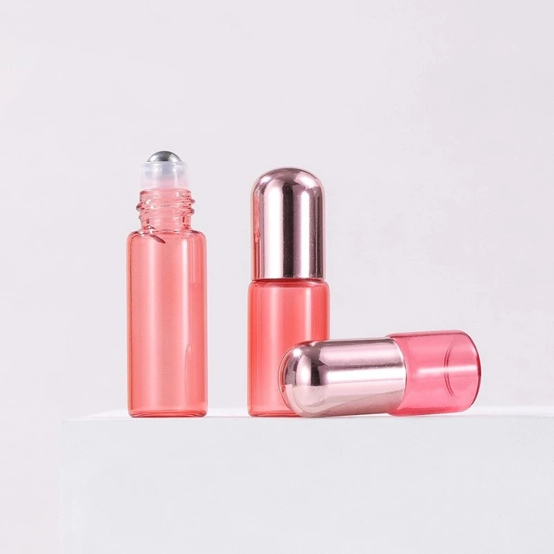
For example, consider a pink glass roll-on bottle with a rose gold dome cap. The pink glass serves as the primary color covering the bottle, while the rose gold cap acts as an accent color at the top, creating a simple yet layered effect.
Color Coordination of Label, Cap, and Bottle Body
The color scheme of a roll-on/roll-off bottle consists of three parts: the bottle body, the label (or screen printing), and the label itself.
-
- Bottle Body: Largest area, determines the overall color tone.
- Bottle Cap: Located at the top of the visual field, suitable for using contrasting colors or metallic colors to create a sense of vibrancy.
- Label/Screen Print: Smallest area, should primarily display text information; neutral colors are recommended to avoid overshadowing the text.
Differences in Color Representation Between Transparent and Opaque Bottles
-
- Transparent Glass Bottles: Color primarily comes from the liquid perfume’s hue. Packaging design needs to consider the layered effect of the liquid color, label, and cap. Note that light-colored liquids have a weaker visual presence in transparent bottles, potentially requiring the use of colored labels or caps to enhance their appearance.
- Opaque Bottles: Color is directly provided by the bottle material, resulting in stronger and more consistent color representation. Suitable for product lines with fixed brand colors and a need for strong brand recognition.
The Impact of Printing and Materials on Actual Color Effects
The same color formula can produce vastly different results on different materials, a crucial but often overlooked aspect in rollerball bottle design.
-
- Transparent glass, with its clarity and high gloss, is highly susceptible to light variations, making it suitable for light colors or gradient effects.
- Colored glass offers rich, stable colors, and its ability to diffuse light through it creates a soft, diffused effect, making it ideal as a carrier for a brand’s primary color.
Furthermore, printing methods (screen printing, hot stamping, heat transfer) and surface treatments (varnish, matte coating) significantly influence the final color effect. It is recommended to confirm color swatches with the factory during the design phase to avoid color discrepancies between the screen and the actual product.
🌸 Conclusion
Looking back at the entire article, from the basic principles of color to the design techniques for small areas like roll-on bottles, from fragrance communication to brand identity and emotional resonance, it’s clear that color plays a far more significant role in perfume roll-on bottle packaging than simply being “aesthetically pleasing.”
The value of color matching ultimately manifests in two aspects: user experience and brand communication. We sincerely advise every perfume brand owner, packaging designer, and independent creator: don’t treat color as a final “decorative step” in packaging, but rather incorporate it into your core strategy from the very beginning of product definition.
What’s the most appealing perfume packaging combination you’ve ever seen?
Feel free to share your “visual ceiling” in the comments!
Last Updated: 2026/06/17

 English
  Italian