
 Italiano
 Português
 Amazon
 Ebay
Ebay
Why Geometric Packaging Appeals to Modern Beauty Consumers
🔷 Introduction
In the past two years, beauty packaging design has been undergoing a transformation towards simplification. The use of geometric elements in beauty and personal care packaging has increased by 37% year-on-year, while the proportion of new products featuring complex curved designs continues to decline.
Geometric forms convey brand messages of “professionalism, precision, and trustworthiness” with lower cognitive costs. This article will analyze the appeal of geometric packaging from three dimensions: psychological mechanisms, social media communication logic, and commercial conversion strategies, providing brands and designers with practical insights from understanding to implementation.
🔷 How Geometric Shapes Capture First Glance?
1. A Natural Application of Gestalt Principles
The “law of closure” in Gestalt psychology states that when faced with an incomplete or simple shape, the brain automatically completes it and quickly categorizes it. Basic geometric shapes such as circles, triangles, hexagons, and squares are the brain’s most familiar “visual shortcuts.”
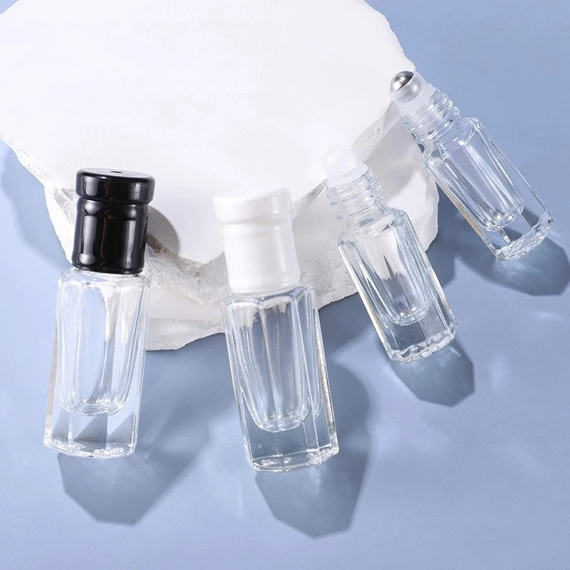
Geometric packaging is not about simplicity, but about “refinement”—it uses the fewest visual elements to create the deepest impression. The Octagonal Transparent Roller Bottle, with its octagonal body between a circle and a square, retains a rounded, approachable feel while adding angular distinctiveness, and the transparent material of the internal roller further enhances a sense of trust.
2. Relationship with Shelf Competition
Modern beauty product shelves have long since moved beyond the traditional single-brand counter model. Online e-commerce waterfall layouts, offline multi-brand stores, pop-up experience counters… each scenario means a massive number of competing products competing on the same surface.
Geometric packaging leverages the “smooth consistency” of most products on the shelf, making the geometric outline the visual center. Whether in offline lighting conditions or online product images, it presents a stronger sense of three-dimensionality and texture.
In conclusion, using geometric language to break visual inertia is not about following trends, but rather the most rational design decision for brands in the battle for attention.
🔷 Psychological Security and Sense of Order
In recent years, consumer decisions have become more than just about function and aesthetics; they’ve also become about emotional compensation and psychological comfort.
1. “Structural Anchors” in Uncertainty
-
- The “anchoring effect” in behavioral economics suggests that people instinctively seek a reliable reference point to aid decision-making in uncertain situations.
- Symmetrical squares, regular octagons, and balanced cylinders—regular shapes in nature—symbolize health, order, and predictability; chaos and irregularity, on the other hand, suggest risk.
- The symmetrical structure of an octagon is subconsciously interpreted as “industrial precision” and “quality control,” while a transparent bottle reinforces the feeling of “no concealment, no redundancy.”
2. The Combination of Minimalism and “Clean Beauty Aesthetics”
-
- Clean Beauty has grown from a niche concept to a mainstream consumer trend. Consumers not only seek “additive-free” ingredients but also demand that packaging convey the same sense of “purity.”
- An unadorned octagonal bottle, clean, straight lines, and restrained neutral colors (such as a black and white cap combination) build trust more easily than overly ornate designs.
3. The Psychological Cue of Touch and Weight
-
- Beauty consumption involves a high level of sensory engagement; consumers not only look, but also touch and even weigh the product. Touch serves as the final confirmation of trust after visual perception.
- Edge-shaped (e.g., octagonal or square caps) structures are robust and suitable for functional skincare and anti-aging serums.
- Rounded, curved (e.g., cylindrical or spherical caps) are soft and smooth, better suited for gentle, soothing, and natural ingredients.
🔷 Sustainability and Rational Consumption
As environmentally conscious consumption becomes increasingly popular, packaging not only protects products but also serves as a crucial vehicle for brands to convey sustainable value.
1. Maximizing Material Utilization
The octagonal structure facilitates standardized production and automated manufacturing, helping to reduce material waste during the production process. Simultaneously, the regular bottle shape is more conducive to transportation and warehousing, improving space utilization.
2. Reusability and Recyclability
When packaging becomes an item that consumers keep for a long time, the brand conveys a long-term value resonance rather than a one-time consumption relationship.
Reusability also reduces the pressure on recycling systems. Currently, the global plastic recycling rate is still less than 10%. The most environmentally friendly packaging is often that consumers actively keep rather than throwing into recycling bins.
The regularity of the geometric structure also makes it easier to disassemble and classify (such as the standardized interface between the bottle body and cap), facilitating end-of-life recycling and adhering to the design principles of a circular economy.
3. Minimalist Design Enhances Environmental Credibility
Compared to complex and elaborate packaging, a simple and transparent design language emphasizes functionality and practicality.
🔷 How Beauty Brands Can Properly Utilize Geometric Packaging?
Geometric packaging can enhance product recognition and brand image, but its true value lies in its integration with brand positioning and marketing strategies. The appropriate use of geometric design is crucial.
1. Define Brand Tone and Choose Appropriate Geometric Language
-
- Different geometric shapes convey different brand impressions. Triangles, hexagons, and other sharp-angled designs convey a sense of technology and innovation; circular designs emphasize gentleness and approachability; square and grid structures convey a professional and rational brand image.
2. Avoid the Design Pitfall of “Geometry for Geometry’s Sake”
-
- The core of geometric design lies in enhancing user cognition, not simply pursuing unique shapes. Overly complex structures may increase consumer comprehension costs and weaken product appeal.
- Therefore, when choosing glass roll-on bottle packaging, brands should strike a balance between innovation and practicality. A simple octagonal bottle body can reflect differentiated design without affecting consumers’ understanding of product functions and user experience.
3. Maintain Visual Consistency Between Online and Offline Channels
-
- Successful geometric packaging should not only be reflected in the product itself but also permeate the entire brand visual system. Brands can extend these elements to e-commerce main images, product detail pages, social media content, and short videos to create a unified visual identity.
When consumers are repeatedly exposed to the same geometric design language across multiple channels, brand recall is more easily established, thereby increasing brand awareness and product conversion rates. For modern beauty brands, geometric packaging is no longer just a container design, but a crucial component of brand visual assets.
🔷 Conclusion
Geometric packaging is becoming a significant design trend in the modern beauty industry. Its appeal to consumers lies not only in its unique visual effect but also in its ability to simultaneously satisfy multiple consumer needs, including cognitive efficiency, emotional order, social expression, and value alignment. Whether it’s a simple and rational square design or an octagonal transparent roller bottle that combines order and sophistication, both can help brands establish a more distinctive brand image in a highly competitive market.
For beauty brands, the focus of packaging design is not on pursuing the “most geometric” or “most complex” shapes, but rather on finding the geometric language that best aligns with brand positioning, product characteristics, and the needs of target consumers. Only when design, aesthetics, and brand value form a unified expression can packaging truly become a crucial asset driving brand growth.
Last Updated: 2026/06/22

 English
  Italian